
Why I Rebuilt EzySplit From Scratch (and What It Taught Me About Shipping)
Every group trip I've been on ends the same way. Someone opens a notes app, someone else opens a spreadsheet, and three days later a WhatsApp message says "bhai, how much do I owe you?" Nobody remembers who paid for the cab.
That's why I built EzySplit: a simple app to split bills with friends, track who owes whom, and settle up with UPI in one tap. The first version was live on the Play Store and people were using it. It worked. But it wasn't something I was proud of anymore.
So I rebuilt it.
Why rebuild instead of patching?
The original app was built on an older React Native setup. Every new feature took longer than the last, builds were fragile, and the UI looked dated next to the apps people use every day. I kept adding fixes on top of fixes.
At some point the honest question wasn't "how do I fix this bug?" but "would I build it this way today?" The answer was no.
Version 2.3 is a ground-up rebuild on Expo with React Native's New Architecture. Same app, same accounts, same data. Everything underneath is new.
What's new for users
Split any way you like. Equal, exact amounts, percentages or shares. Multi-item bills too: add each item and its price, and EzySplit adds up the total.
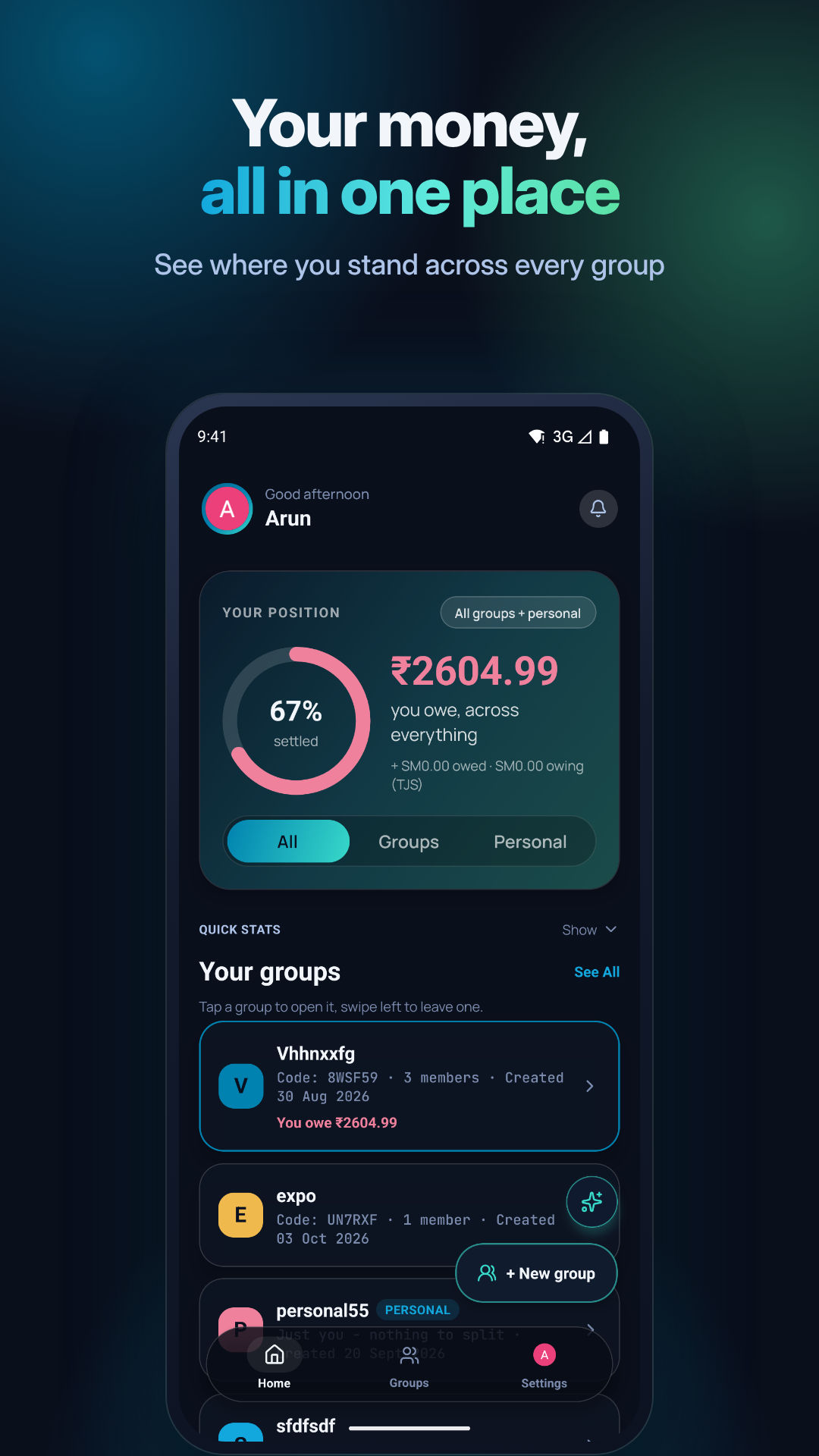
Know where your money goes. Personal expense lists sit next to your groups, so you can track your own spending without inventing a fake group for it. Group insights show total spend, your share, and this month compared with last.
Settle up without the awkwardness. Live balances show who owes whom at a glance. Tap settle, your UPI app opens with the amount already filled in, and the balance updates for everyone.
Groups that stay private. Invite people with a link, a 6-character code or a QR code. Admins approve join requests, and a group can be locked so nobody new joins.
A design I actually like. A dark, glassy interface with smooth animations and gentle haptics. Small things, like the search bar replacing the title instead of taking up extra space, make it feel calmer to use.
The part nobody sees: shipping to real users
Rebuilding a hobby project is easy. Rebuilding an app people already rely on is not. Real people have real balances in EzySplit, and there's only one production database.
So I set myself one rule: every data change must be additive. New fields can be added, but nothing existing gets renamed, moved or deleted. Someone on the old version and someone on the new version can sit in the same group and both see correct balances. It sounds boring, but this rule shaped almost every decision in the rebuild.
A few other lessons:
Test the update, not just the install. A fresh install working proves very little. What matters is installing the new version over the old one and checking you're still logged in with your groups intact.
Separate dev and prod properly. EzySplit now has its own development Firebase project, so I can break things freely without touching anyone's real data.
Privacy is part of the product. The rebuild came with a proper privacy policy, a clear account deletion flow, and no advertising ID, because the app has no ads.
Haptics should be quiet. My first version of the chat feedback vibrated on every token. It felt like the phone was nervous. One tap at the start and one at the end was enough.
What's next
There's an AI assistant in the works: ask "how much did I spend on food this month?" and get an answer from your own EzySplit data. It's being tested quietly and will come in a later release, once it's genuinely useful and not just a gimmick.
After that: Hindi support, shareable trip summaries, and anything my users keep asking for.
Not perfect. Shipped anyway.
EzySplit still isn't perfect, and it never will be. But it's faster, cleaner and more honest about your data than it's ever been, and it's in people's hands.
If you split bills with friends, flatmates or family, give it a try and tell me what breaks:
Feedback, bugs and feature ideas go to ezysplit.techtiten.com/support. I read every message.